

We're a few weeks in and 2018 is already shaping up to be an innovative, exciting year. Creativity is a conversation. A conversation that ebbs and flows with time. This is the first of Inbound Design Studio's "trends to watch" series, so join us as we analyze what trends to watch for this year.
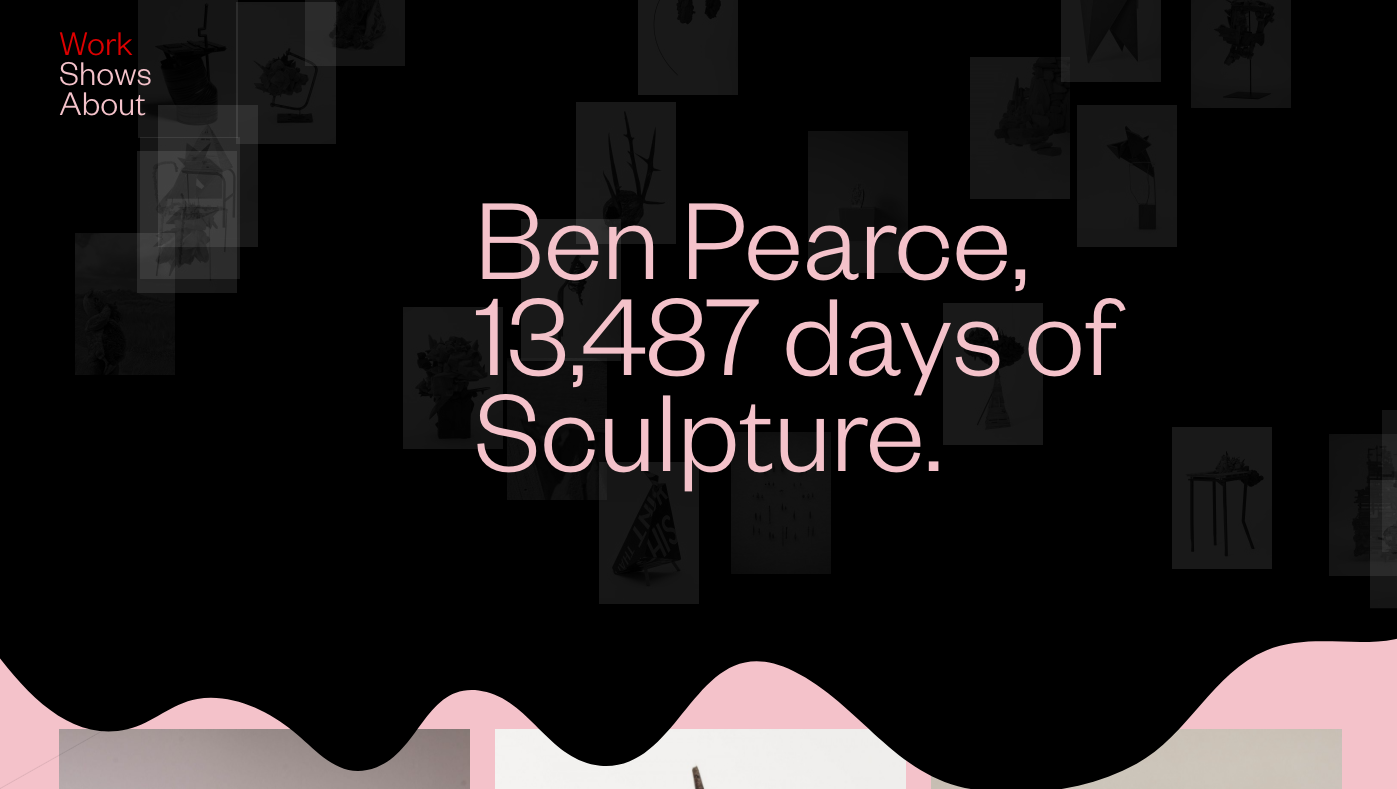
In order to better communicate their core message, some companies are paring down their website to the bare minimum. Ben Pearce keeps it cool with a pop of color and a wavy line effect on his menu, but his galleries are clean and inviting.
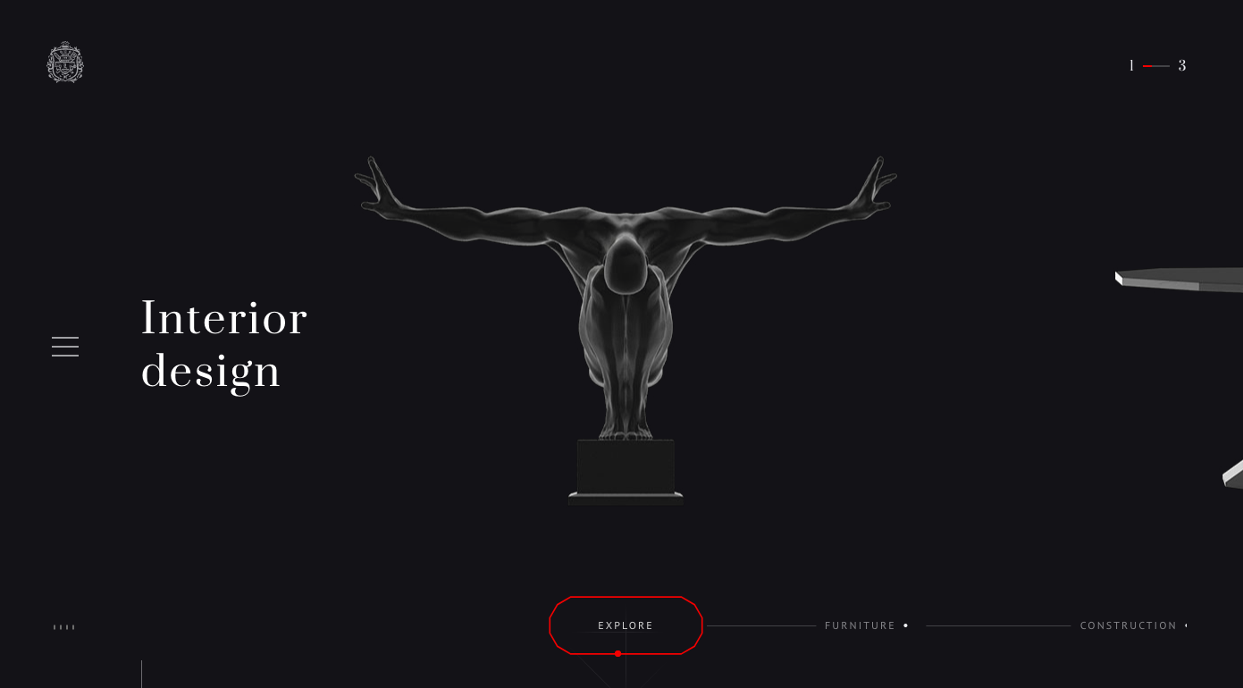
Web animation is also going to be increasingly popular as more companies tell their stories online. Users are pushing themselves further and further within their buyers' journeys and wanting to know more about the companies they purchase from. Which means your website has to work harder to get your customers the information they need, just when they need it. The Leviv Group out of Russia has a beautifully crafted animation that informs the user exactly the type of interior design they specialize in, and how they elevate your home from the inside out.
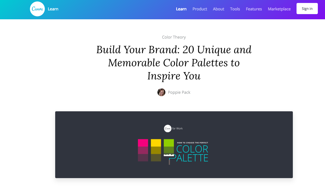
As usual, your company colors are an integral part of how your customers identify you. Certain colors are said to conjure up specific emotion to your customer. Although that may be true, 2018 is going to be the year of adventurous color choices from companies large and small. In a space that's harder to get noticed, adding a color to your palette might be all you need to boost engagement or impressions. Canva does it well and can advise you on how to tackle that project yourself.

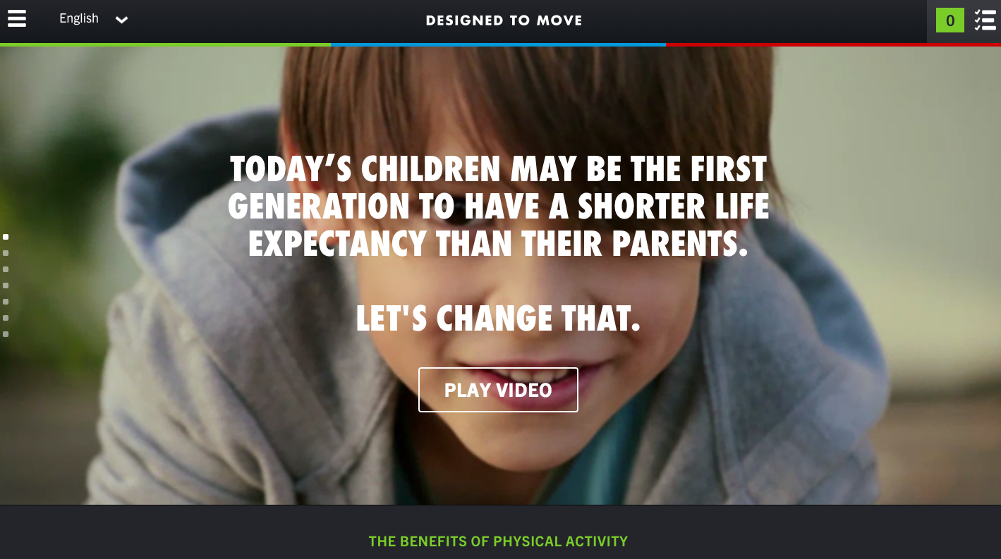
Auto-play videos of high-quality speak volumes about brands that would otherwise require large amounts of text to justify their motives. Designed to Move uses an auto-play video to stimulate emotion and curiosity in their website's users. High-quality videos are a great way to encourage your users to stick around and click around.
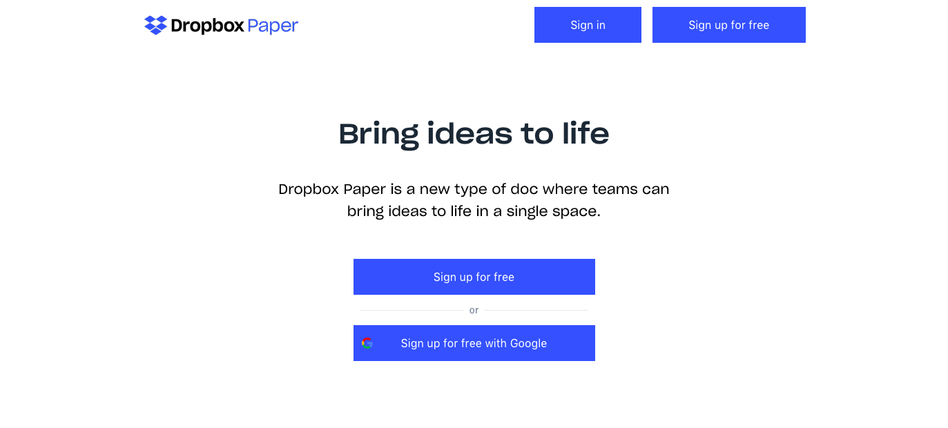
Interactive sites with their own, custom applications are going to be the norm. With the increased availability of coders and website gurus, more companies are creating personalized customer experiences that identify uniquely with their company. Mic drop...box paper?
6. Engaging visuals take center stage
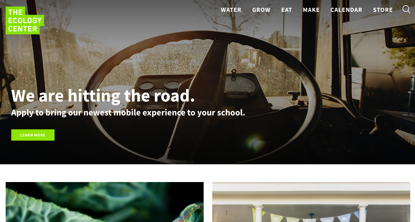
With improving screen resolution, photographs are becoming more and more beautiful to look at. You'll notice how The Ecology Center uses engaging photographs to draw you into their content, oozing ecological conservation from every frame.
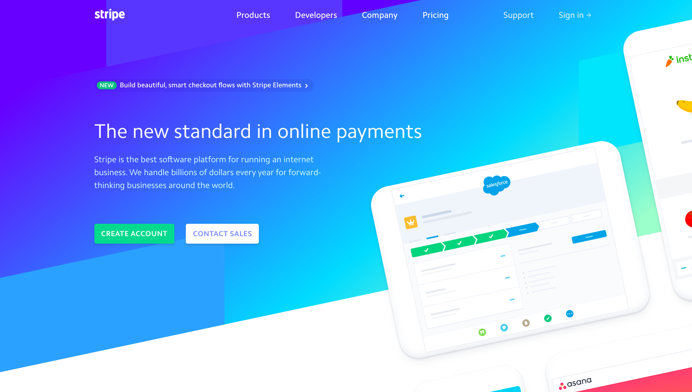
Over time the boxes on our favorite sites like Google, Twitter, Facebook, and many others, have become rounder and rounder. Those round shapes are soft and friendly on the user's eyes and inviting when it comes to entering type. Don't expect these shapes to go anywhere soon. In fact, expect to see more. Stripe uses them effectively in their website, and then mimics the same shapes within their application.
Brutalism is defined as design that is rough, jarring, and ragged. From interactive cursors to blatant disregard for intuitive UX design, brutalism has found a place in millennials' hearts. This Lazy Eyes site has slot-machine animation upon loading, paired with a white-glove cursor and chewy menu options to boot. The art gallery really goes above and beyond to use these effects to create a distinctive brand that identifies itself through it's artwork and website.
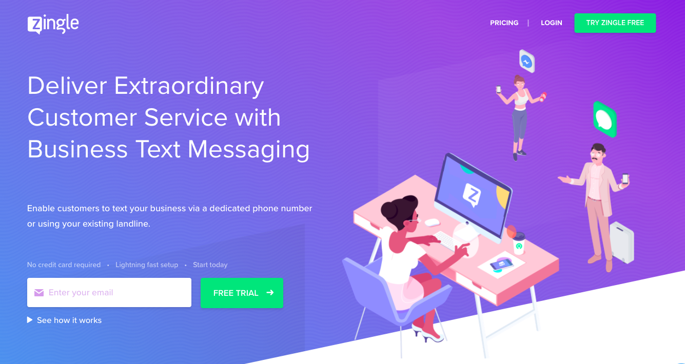
Now is the time for playful, smile-worthy illustration to grace your webpage. Not only does Zingle craft cute characters to illustrate their software's abilities, they use a bright color scheme to continue the happy vibes (did anyone notice that "adventurous colors" was one of our earlier tips?).
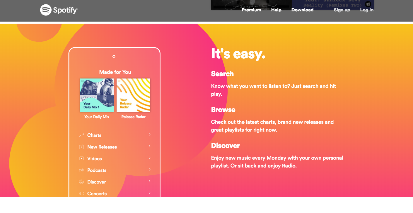
Spotify uses asymmetric design to communicate ideas, show album covers, and show all website visitors Spotify is the way to jive these days. The asymmetry leads the user further and further into their website. By the time you reach the bottom of the first page, you know exactly how Spotify works and how you can purchase it today.
For more useful information, follow us on one of our feeds.


 Austin Walker